Crafting Compelling Carousel Ads on Facebook: Best Practices and Tips
23 Aug, 2023
Discover the best practices for crafting compelling Facebook Carousel Ads that engage and convert. Learn design tips, storytelling techniques, and common mistakes to avoid.
Jump to:
Hop on our weekly newsletter train! We're sharing tips so stellar, we're practically job-threatening ourselves!
Facebook advertising offers a smorgasbord of formats and features to creatively engage your audience. But standing tall among them like the Beyoncé of ad formats, is the Carousel Ad. 🌟 With its ability to showcase multiple images, videos, headlines, and CTAs in a single ad unit, Carousel Ads are far from your average, run-of-the-mill ad—they're a marketer's Swiss Army knife for storytelling, product showcasing, and conversion optimization. 🛠
So, if you've ever sat there wondering how to make your Facebook ads as versatile as a Swiss Army knife (or as beloved as Beyoncé), you're in the right place. 📍 This guide dives deep into best practices and tips for crafting Carousel Ads that not only grab eyeballs but also get those thumbs tapping. 👀👍

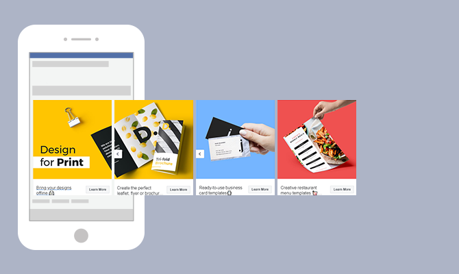
Photo courtesy of Creatopoly
What Are Facebook Carousel Ads?
At its core, a Facebook Carousel Ad is like a mini interactive catalog right in your feed. Instead of serving you a single, static image, it gives you a variety of content that you can scroll through horizontally. It's like Netflix, but for advertising—you've got options! 📺
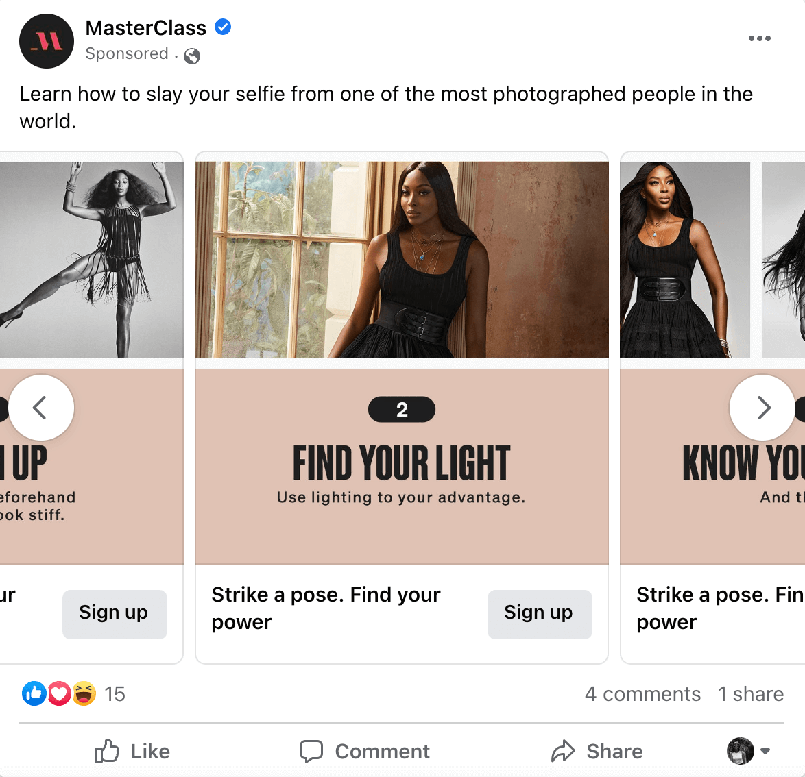
Each "card" in the carousel comes with its own set of customization options, such as individual headlines, descriptions, and call-to-action buttons. Think of it as a tapas platter of ads; each little dish can stand on its own, but they're best enjoyed together. 🍱

Photo courtesy of Hubspot
Who Can Benefit From Carousel Ads
Facebook Carousel Ads are a versatile tool, which means they can be incredibly useful for a wide range of businesses and product types. However, some may find them particularly beneficial:
E-commerce Brands: For online retailers, Carousel Ads can function as a mini-catalog, showcasing a range of products with the ability to link directly to individual product pages for each item displayed. Think of them as your own pocket-sized Vogue magazine, a mini-catalog for fashionistas and shopaholics alike. 🛒
Service-based Businesses: From accounting firms to zen garden designers—showcase your services—such as customer testimonials, before-and-after photos, or the different services you offer—in one compelling package. Multifunctional and indispensable. 🧰
Real Estate and Travel: Perfect for showing off that beachfront property or hidden mountain retreat—carousel ads are a powerful tool for real estate or travel firms to showcase property features and for travel companies to display various destinations, accommodation options, or travel packages. 🏠✈️
SaaS Companies: Software as a Service (SaaS) companies can use Carousel Ads to demonstrate various features of their software or even to take the user through a step-by-step guide of how their solution solves a problem. Why just tell when you can show and tell? Take users on a delightful, step-by-step journey through your software. 💻🔄
Non-Profits and Causes: For non-profits looking to tell a compelling story to potential donors, the carousel format offers a way to present a narrative—perhaps showing how a donation can make an impact—from start to finish across multiple cards.
Educational Institutions: Let's face it; brochures are so 20th century. Show off your campus, courses, and success stories in style! 🏫
;Restaurants and Food Services: Give your audience a virtual food tour right in their feed. Restaurants can utilize Carousel Ads to display various dishes, a new seasonal menu, or even to take the user through a "day in the life" of their restaurant. 🍔
If your business craves more nuanced storytelling or multi-feature showcase, Carousel Ads are like that multi-tool you didn't know you needed but now can't live without.
Benefits of Carousel Ads
While standard Facebook ads—such as single-image or single-video ads—have their merits, Carousel Ads offer distinct advantages that can amplify your advertising effectiveness. Let's break down some of these benefits:
Rich Storytelling: One of the strongest assets of Carousel Ads is the capacity for layered storytelling. Standard ads can deliver a single, strong message, but Carousel Ads can tell a story over a sequence of cards, making the messaging more engaging and immersive. It's like the Netflix of ads—you're not just stuck with one episode; you get an entire season of content to binge on! 🍿📺
Greater Product Exposure: With standard ads, you have one shot at capturing attention. Carousel Ads let you feature multiple products, services, or features, giving users more reasons to click through. Each card can direct users to a specific landing page, allowing for a tailored shopping experience. Why settle for one when you can flirt with many? Carousel Ads let you show off, big time. 💅
Higher Engagement: It's not just an ad; it's an interactive experience. The interactive swiping feature inherently encourages more engagement. Users can easily scroll through your content horizontally, making the ad format more interactive and engaging than static ads, which often results in higher click-through rates. 👆
Lower CPAs: More bang for your buck! Because you're getting more real estate to tell a compelling story or feature multiple products, Carousel Ads often see a lower cost per conversion compared to standard ads. Users are more likely to find something that piques their interest, leading to more meaningful interactions.
Increased Flexibility and Creativity: The multiple cards in Carousel Ads allow for considerable creative freedom. Unleash your inner Picasso or Spielberg. Panoramic views, step-by-step tutorials, or a mini rom-com; you're only limited by your creativity. 🎨🎥
Advanced Customization: Unlike standard ads, each card in a Carousel Ad can have its own headline, description, and call-to-action, enabling highly personalized messaging tailored to the content of each individual card.
Detailed Analytics: Facebook provides card-by-card reporting for Carousel Ads, allowing you to understand how each segment of your carousel is performing. Forget vague palm readings; Carousel Ads provide a detailed roadmap of your performance. Which card did they love? Which did they skip? It's all there.🔍
How to Get Started Using Carousel Ads
So you're ready to hop on the carousel, eh? Hold on to your hats; it's not just for kids at the fair! Here's how to take it for a spin.
Design Considerations
With any Facebook ads, the visual components of the ads often are more impactful than the text elements. The design aspect of your Carousel Ad plays a significant role in capturing attention and inspiring action. Here are some design elements to consider:
Consistent Visual Theme: Do your best to maintain a coherent visual theme across all cards in your carousel. Consistency in color scheme, typography, and image style can make your ad more visually appealing and professional. No rogue models wearing polka dots when everyone else is in leather jackets, please.
High-Quality Images: It's 2023, not 1995. We don't want any pixelated images making your brand look like it’s still buffering. Use high-resolution images that look good on both desktop and mobile.
Focused Messaging per Card: Each card should carry a concise message or concept. Overloading a card is like mixing heavy metal with opera—confusing and a bit scary.
Creative Storyboarding: Think of your Carousel Ad as a storyboard. Each card should contribute to an overarching narrative or theme. The first card should grab attention, the middle cards should provide valuable information, and the last card should include a compelling call to action. Lights, camera, action!
Thoughtful Card Order: The sequence is everything. It's like telling a joke; the punchline doesn't come first. Whether you're telling a story or showcasing products, the order should be logical and intuitive to keep your audience engaged.
Use of Text Overlays: Sure, a picture is worth a thousand words, but a few well-placed words can make a picture priceless. Just don't turn it into a novel—Facebook caps text at 20% of the image area.
Call-to-Action Buttons: Each card can have its own call-to-action button, so choose wisely based on what each card is designed to achieve. Options include "Shop Now," "Learn More," or "Contact Us."
Test and Iterate: It’s always a good idea to create multiple versions of your ad to A/B test different images, text, or calls-to-action to see what resonates most with your target audience.
By paying attention to these design elements, you can create Carousel Ads that are not only eye-catching but also effective in driving the action you want your audience to take.
Crafting Your Story
Carousel Ads offer a unique platform to convey a more layered and detailed narrative than most other ad formats. You're not just pushing a product; you're telling a story. So, grab your director's chair; here's how to script your ad saga: 🎬
Start with a Hook: Your first card needs to grab attention immediately. Whether it's an intriguing question, a striking image, or a bold statement, make sure it compels your audience to "tune in" for the next episode.
Establish the Plot: The subsequent cards should build upon the initial hook. This is where you can elaborate on the problem your product solves or the need it fulfills. Show a little empathy here; you’re not a robot, let your audience know you understand their pain points or desires.
Introduce Characters, Products, or Features: If applicable, this is a great time to introduce the 'characters' in your story—be they real people who benefit from your product or the features and benefits of the product itself. Show how they interact, overcome challenges, or provide solutions. Whether it's testimonials from satisfied customers or a spotlight on killer features, make sure they contribute to the overarching plot.
Provide Resolution with a CTA: The final card should wrap up your story neatly and guide the audience on what to do next. Use a clear and compelling call-to-action like 'Shop Now,' 'Learn More,' or 'Sign Up.' You can even offer a limited-time discount or bonus to incentivize immediate action.
Keep It Simple, Yet Engaging: You're not writing a novel; your story needs to be simple enough to understand within a few seconds that people will engage with your ad. Your audience should get the gist and feel the urge to act—all in the span of a few seconds.
Emotionally Connect: The best stories evoke emotion. Be it humor, nostalgia, or inspiration, make sure there's at least one 'aww,' 'aha,' or 'OMG' moment that aligns with your brand's character.
CTA (Call-to-Action) Best Practices
A well-placed and thoughtfully crafted call-to-action (CTA) can be the pivotal element that turns a viewer into a customer. Here's how to optimize your CTAs within your Carousel Ads: 🎯
Match the CTA with the Card's Message: One size does not fit all when it comes to CTAs in Carousel Ads. If one card is teasing a feature, something like 'Learn More' makes sense. But if another card shouts about your latest product, then 'Shop Now' will likely seal the deal.
Keep It Simple and Direct: Ditch the riddles and poetic nuances. Your CTA should be as straightforward as an arrow aimed at a target. Stick with time-tested, easily digestible phrases like 'Buy Now' or 'Get Started.'
Add Urgency or Scarcity: If the clock is ticking or the shelves are emptying, let your audience know. Phrases like 'Last Chance' or 'Limited Offer' act like a mini adrenaline rush, nudging people toward swift action.
Test and Optimize: You'd be amazed what a tweak in wording can do. Always keep an A/B testing laboratory active to distill your CTAs down to their most potent form.
Don't Forget the Thumbs: CTAs should be thumb-friendly for mobile users. Facebook gives you a smorgasbord of CTA button shapes and sizes—choose one that plays nicely with both point-and-click and point-and-tap interfaces.
Align with the Landing Page: Your CTA and the subsequent landing page should be in lockstep. A disconnect between the two is like a plot hole in a movie—a surefire way to lose your audience's engagement.
Tracking and Key Metrics
Your Carousel Ads are live, but your work is far from over. It's time to become a data detective, diving into metrics that matter far beyond simple clicks and impressions. Here's your blueprint for tracking performance and making data-driven decisions. 📊
Click-Through Rate (CTR): Think of CTR as your ad's curb appeal—the higher the rate, the more viewers are enticed to step inside your brand's world. It's an immediate gauge of how well your ad's copy and visuals are vibing with your audience.
Conversion Rate: It's not enough for people to visit; you want them to settle in. Whether that's making a purchase or filling out a lead form, this metric shines a spotlight on the ultimate effectiveness of your Carousel Ads.
Cost Per Conversion: Are your ad dollars working as hard as they could be? Monitoring cost per conversion helps you fine-tune your bidding strategy, ensuring that you're not just spending but spending wisely.
Engagement Metrics: Likes, shares, and comments are your audience's way of giving you a round of applause. High engagement not only boosts brand recall but also provides a treasure trove of insights into what makes your ad a hit.
Card Engagement: Facebook gives you a card-by-card performance breakdown. Use this goldmine of data to identify which cards are the show-stoppers and which need a rewrite.
Mobile Metrics: Mobile isn't just another channel; it's often THE channel. Segment your metrics by device type to get a granular view of how your ads are performing in a mobile-first world.
Attribution Models: Utilize Facebook's different attribution models to understand how your Carousel Ads contribute to customer journeys that may involve multiple touchpoints. facebook offers a palette of attribution models for you to understand your ad's role in the broader customer journey, which often involves several interactions across multiple platforms.
Common Pitfalls: Navigating the Carousel Without Falling Off
Facebook Carousel Ads are more than just pretty pictures; they're a tool designed to tell your story and engage your audience. However, even with the best intentions, it's easy to make missteps. Here are some common traps to sidestep on your road to Carousel Ad mastery. After all, the devil's in the details, but so is the divine. 🎠
Information Glut: Less Is More: The allure of cramming tons of details into your cards can be intoxicating, but resist the urge. Overstuffing your ads will likely leave your audience overwhelmed not informed. Aim for one cohesive message or theme per Carousel Ad.
Plot Holes in Your Story Arc: Carousel Ads are storytelling tools. If your cards read more like a disjointed anthology than a focused narrative, you'll lose your audience's attention. Ensure a natural, logical flow from the first card to the last.
Neglecting Mobile Optimization: As previously mentioned, mobile is often the main stage, not a side act. Overlooking mobile optimization is a recipe for diminished returns and squandered ad dollars.
Pixelated Problems: Your ad's visual elements are its calling card. Subpar or irrelevant images can sabotage your message and send potential customers scrolling past. Always opt for high-res, relevant visuals
Brand Schizophrenia: Inconsistent fonts, colors, or messaging can be a jarring experience for your audience. Make sure all cards sing in harmony with your brand's established visual and verbal language.
Overcomplicating the CTA: A simple, direct CTA works best. Overcomplicating your call-to-action can confuse users and reduce click-through and conversion rates.
Ignoring Analytics: If you’re not tuned into your key performance indicators, you're essentially sailing without a compass. Consistent review and action based on analytics are non-negotiable for optimizing your campaigns.
Poor Landing Page Alignment: Remember, your Carousel Ad is the appetizer, not the main course. A mismatch between your ad and the landing page it leads to can result in audience drop-offs and, ultimately, wasted resources.
Conclusion: Key Takeaways and Next Steps
Facebook Carousel Ads are no joke. They're a fantastic platform for telling stories, showcasing products, and actually engaging with your audience—not just collecting "oohs" and "aahs." But like juggling while riding a unicycle, there's an art to keeping all these elements in harmony.
You'll want to pay attention to design just as you would a plot twist in your favorite show. Craft your story like you're building suspense in a blockbuster. Optimize your CTAs to be as clear and irresistible as grandma's apple pie recipe, and never ignore data analytics—those numbers are the critics of your marketing theater. The difference between a blockbuster ad and a budget sinkhole often comes down to the nuances.
Ready for Action, or Still on the Fence? 🤔
If the thought of diving into the Carousel Ads scene is making your palms a bit sweaty, DriftLead is here to help. We offer free marketing plans that are the equivalent of a GPS for your advertising journey. And let's be real, who couldn't use a co-pilot when venturing into the bustling bazaar of Facebook advertising?
Interested in turning your ad game from 'good try' to 'why, oh my!'? Secure your free marketing plan from DriftLead today and discover what your business is truly capable of.


