How to Increase Mobile Conversion Rate The Easy Way
12 Dec, 2023
Discover key tactics to skyrocket mobile conversion rates with DriftLead. Learn how to optimize your mobile site or landing page.

Jump to:
Hop on our weekly newsletter train! We're sharing tips so stellar, we're practically job-threatening ourselves!
Nearly 60% of online traffic now comes from those handy devices we carry everywhere – our smartphones. That's right, more than half of the digital universe is thumbing through life on a screen smaller than a slice of bread. In a world where we can order a pizza, find a soulmate, and book a trip to Bali in just a few taps, it's no wonder mobile commerce is the new frontier.
But here's the kicker: while everyone's busy swiping and tapping, converting these mobile mavens into customers can be as tricky as getting a perfect selfie on the first try. The average mobile conversion rate? A disappointing 2.9%. That's like throwing a party and only having three out of a hundred invitees show up. 🎉😕
At DriftLead, we understand that boosting mobile conversion rates in the fast-paced express lane of digital marketing is not just a 'nice to have' – it's a must. So, buckle up as we dive into mobile conversions, where the potential is as vast as your favorite streaming service's watch list. We're here to guide you through the maze of mobile optimization with tips that will turn those taps and scrolls into revenue.
The Importance of a Mobile-First Approach
Treating mobile optimization as an afterthought is like showing up to a black-tie event in flip-flops – you're just not prepared. With over 5.22 billion mobile users globally, it's clear that smartphones are the VIP guests of eCommerce.
In the era of TikTok and iPad kids, you'll be hard-pressed to find people facing an ounce of potential boredom and not glued to their devices.
But while there is an abundance of them, mobile users are a tough crowd to please. They're like gourmet food critics, but for websites. If your site takes too long to load, or if navigating through it feels like solving a Rubik's Cube, they'll swipe left faster than on a bad dating profile. 🚀💔
Top Tactics to Increase Mobile Conversion Rates
Ready to turn your mobile site into a conversion powerhouse? Let's dive into the top tactics to get people purchasing.
Make the Most of the Header
It only takes 0.5 seconds for a user to form a first an impression of your website..that's faster than you can say "stay!" And the header of your mobile site is the first thing people see when they go to your website or landing page and is what determines that first impression – it can make or break the deal. In the bustling bazaar of the internet, a cluttered header is like a noisy street vendor, overwhelming and easy to bypass. 🚧👀
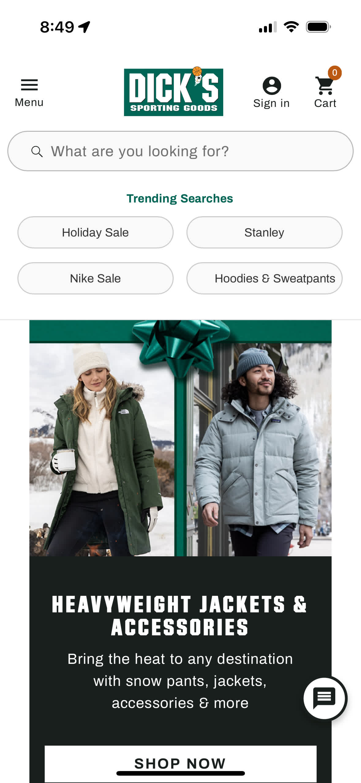
A sleek, minimal header, on the other hand, is your golden ticket. It's about keeping it as clean and straightforward as your intentions on January 1st. Remember, in the world of mobile browsing, less is more. A distraction-free header ensures your users' eyes are exactly where you want them – on your products, deals, and content.
In the case of mobile, this may mean skipping the traditional hero image altogether and resorting to a search bar or some easy navigation buttons to help users find what they are looking for, like Dick's does below.

Prioritize Transactional Links in the Hamburger Menu
In the culinary world of website navigation, the hamburger menu is your appetizer – it should be tantalizing enough to lead to the main course: your products and services. 🍔👀
Think of it this way: your brand's story might be compelling, but when users tap that menu, they're usually not there for the backstory. They're there to browse, shop, or check out. It's like walking into a store and finding exactly what you need right at the entrance.
So, line up those transactional links – Bestsellers, New Arrivals, Shop by Category – right where users can find them without a scavenger hunt. The goal? To turn casual browsers into buyers, as swiftly as a seasoned shopper zeroes in on a sale sign.
See how Nordstrom puts the Sale in red at the top of the menu.

Optimize Product Listing Pages
Product listing pages on mobile are the unsung heroes in the world of e-commerce. They're like the middle chapters of a good book - if they're engaging, your readers (or in this case, users) will stick around for the ending.
The trick lies in the balance between visual appeal and functionality. A grid view works wonders for visual products, showcasing items like a curated gallery. On the flip side, a list view offers more details at a glance, perfect for products where specifications are king.
But it's not just about looks. Speed and ease of navigation are the real MVPs here. Users should be able to sift through options as easily as flipping through a magazine. Incorporate a responsive search bar, clear and honest product ratings, and filters that don't require a manual to understand.
Touch-Friendly User Experience
Mobile optimization is about catering to the thumb – the unsung hero of mobile navigation. Just like a good pair of shoes makes a day of walking enjoyable, a mobile site optimized for touch makes browsing a pleasure, not a chore.
Consider the ergonomics of thumb movement. Most users are scrolling, tapping, and swiping with one hand, their thumb doing most of the work. Your site's design should acknowledge this reality. Key elements like navigation buttons, CTAs, and interactive features need to be within easy reach of the thumb's natural arc.
Users shouldn't have to stretch, strain, or adjust their grip to interact with your site. A touch-friendly design is intuitive, effortless, and, most importantly, effective in keeping users engaged and driving them towards conversion.
Empower the Search Function
In a world where speed is currency, excellent search functionality is a must-have for e-commerce websites.
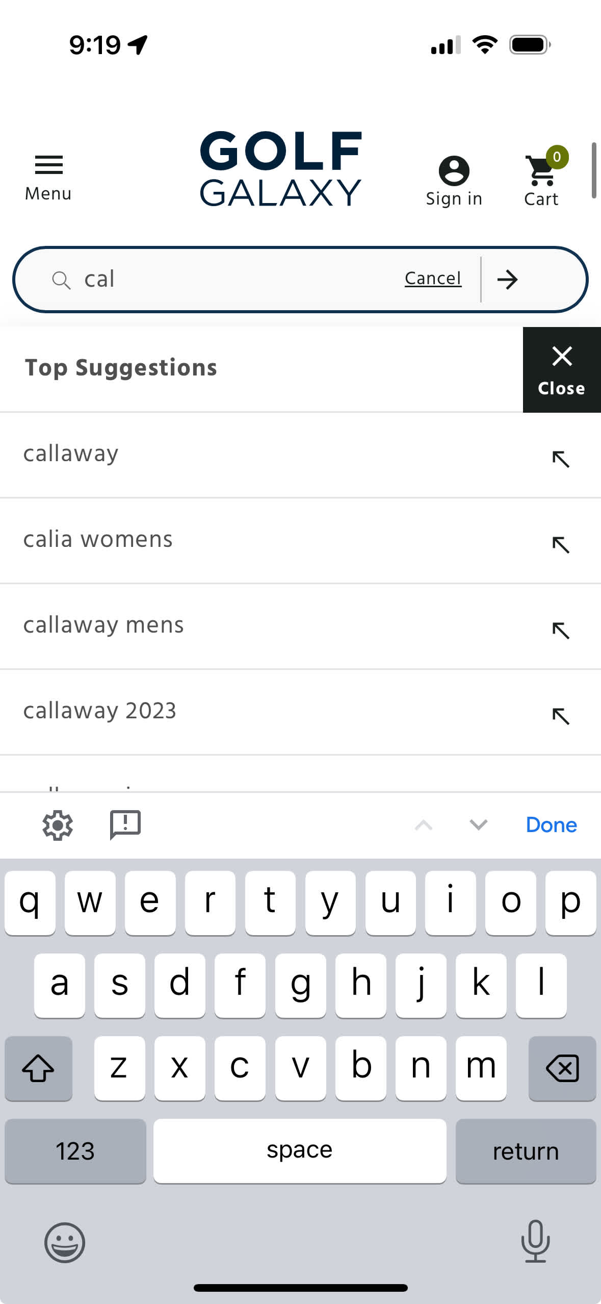
Consider the search bar as your site's personal assistant. It needs to be sharp enough to understand 'sneakers' means the same as 'trainers', and forgiving enough to know that 'exspresso' is just a slightly embarrassing mistaking of "espresso"...which...it may or may not be judging 🤨 . This isn't just about correcting mistakes; it's about understanding user intent, even when it's not perfectly articulated.
A powerful search function is the unsung hero of the user experience. It's the difference between a user staying on your site or drifting away. It's about making every search a smooth, hassle-free path to exactly what they need, and perhaps a few things they didn't know they wanted.

Intuitive and Persuasive CTAs
Your Call-To-Action (CTA) buttons are like the decisive moments in a chess game. Each move should be intuitive, strategic, and persuasive, guiding the user effortlessly toward a checkmate – or in this case, a conversion.
A well-crafted CTA is more than just a button; it's a beacon, guiding users through the fog of information. It should stand out like a lighthouse on a dark night, clear, compelling, and impossible to ignore. Whether it's a vibrant "Buy Now" or a reassuring "Learn More," each CTA needs to be a clear call to action, not a whisper in the wind.
Remember, the power of a CTA isn't just in its words; it's also in its placement and design. It should be as easy to find and click as the snooze button on your alarm clock – familiar, accessible, and right where you need it when you need it.
The Need for Speed in Mobile Conversions
Nobody likes waiting, whether it's for an espresso, a traffic light, or a webpage to load. In an age where patience is as thin as the latest smartphone, a slow site is like a long line at the gas station – people will just drive off to the next one. This is particularly why advertising platforms and search engines use site speed as a determining factor in ranking performance and quality scores.
The stats speak for themselves. A delay of a few seconds in page load time can spike bounce rates, just like a sudden hike in gas prices can empty a highway. On the flip side, shaving off those seconds can boost customer engagement and conversions, much like a drop in fuel costs can lead to more road trips.
Optimizing your site's speed isn't just a technical tweak; it's a key business strategy. It's about giving your users what they want before they know they want it – fast, seamless access to your products and services. In the fast lane of mobile commerce, site speed isn't just about pace; it's about staying ahead of the curve.
Conclusion
As we wrap up this journey through the landscape of mobile conversion optimization, remember that each of these tactics is a piece of a larger puzzle. Like the ingredients in a master chef's signature dish, they work best when blended skillfully. From the welcoming simplicity of your header to the persuasive power of your CTAs, every element plays a crucial role in guiding your mobile visitors toward making a purchase.
But knowing the ingredients isn't the same as cooking the meal. That's where DriftLead steps in. We're not just about ideas; we're about turning those ideas into action results into revenue. Whether you're looking to refine your mobile user experience or overhaul your digital strategy, our team is ready to bring its expertise to your table.
Get your FREE marketing plan to see where your website or landing page can improve.


